
       
|
|
| 
|
|
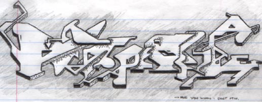
Atome Omiyage E
Completed on June 3, 1999
This was the first of two drawings I did, after I saw some badass grafitti from a guy who called himself 'Atome'. His style was very over-the-top, much in the same way that other grafitti artists were, but his was different - he somehow managed to be just as vibrant and eye-catching using nothing but straight angles and angled curves, instead of the pointed streaks that so many other artists of the genre (myself included up until this point) had used.
I believe you can see some of his work at Grafitti.org - a great place to see some really awesome stuff.
Anyhow, I decided that I must get into this style, and quickly discovered it's harder than it looks. The image seemed to really be something when I was drawing it, but whenm I took a step back after it was done and looked at it as a whole, it looked like a big mess.
Atome's stuff was a always big mess as well, but it had a certain quality mine didn't. I came to understand later that I needed to focus on the overall impact of the design, not just the letters themselves. This image (and the one that follows it) really have no cohesiveness in that regard.
However, I tried again in a few days with a 'Demiforce' logo, and I seemed to have learned a thing or two in that regard. The design still stands today as my website's splash logo... |

|
|
 |
|
 |
|