
       
|
|
| 
|
|
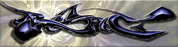
Respect"NPM
Completed on July 17, 1999
This is my favorite image I've ever done. Ironically, it was done simply as a freelance project for a short-lived console group (Respect, a division of Napalm), carrying really no deep meaning with it at all. On top of that, the guy I made it for didn't seem to like it much. Despite all this, it's grown on me since then - I have a 60"x20" framed printout of it hanging in my living room.
I almost didn't go with this design. I orignally had a very different sketch for what I wanted it to be like - in comparison to this it looks more like what you'd see on a baseball jersey. However, I always worry when I'm under the stress of a freelance job, and doubt myself even more than I normally do. In this case, it was a good idea to doubt - it caused me to scrap my first sketch and start again, eventually bringing me to what you see here.
The S came first, of course - I knew I wanted to do a big S sometime in my drawing career, since I'd seen many grafitti portraits which were tied together very well with the curvature of a nice, big S. After I'd gotten a nice contour for it, I moved on to the other letters, and then did the edging and lighting. However it wasn't until I rendered the background in my beloved vortex tiler that I knew I had a keeper. With a few small adjustments, I had before me what would be my best work yet. |

|
|
 |
|
 |
|